Figma Tutorial - How to Create a Responsive Navigation Menu
It is important to think about your design as a dynamic piece even if you’re working on a static Canvas.
If you want to design a layout for multiple devices screens using Photoshop or Illustrator, you have to produce different frames for each layout.
Now with Figma, it is possible to create dynamic frames. One single frame can fit multiple devices screens.
In this brief tutorial, i will show you how you can design a responsive Navbar using Figma.
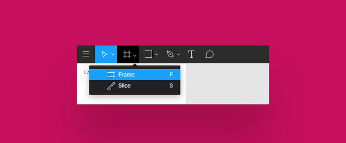
1- Create a new frame
- First go the toolbar and pick the frame tool
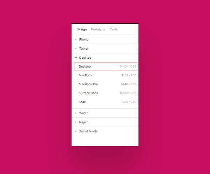
- Select a desktop frame size In the proprieties panel.
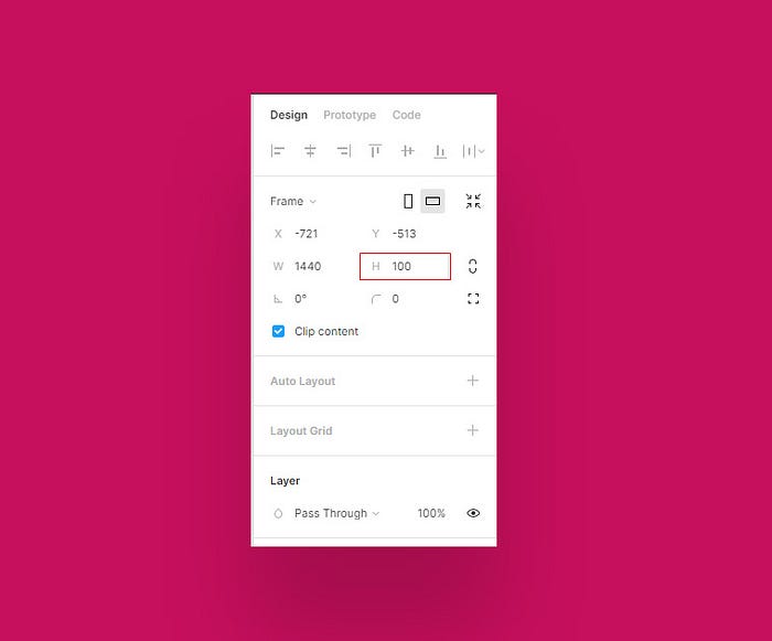
- Resize the height of your frame to 100px
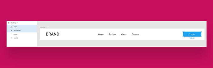
2 - Create the Navbar basic elements :
*Before you start creating any new element. First, select your frame, so every element you create will be inside of that frame.
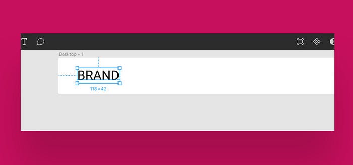
Logo :
Create a simple text with a generic brand name as a logo.
Alignments :
- Select the logo layer and go to the alignment section in the top sidebar.
- click on Align left then Align Vertical Center to set its position inside the frame.
Menu :
For the menu. it will be a simple list of text layers with pages names.
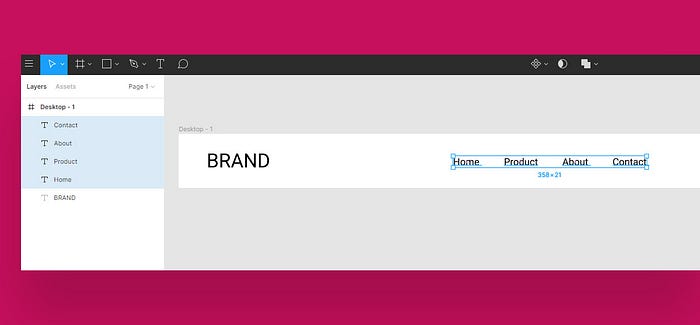
Layers group :
- Select all the text layers of your menu and click Ctrl + G or Command + G to group your menu inside one unit.
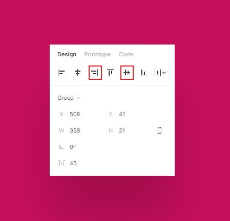
Alignment :
- Select your Menu and go to the proprieties Panel in the sidebar.
- Set the alignment of your Menu to the Align horizontal center and then Align Vertical Center.
Button :
Create a basic button with a simple shape and a text layer.
Layers Group :
- Click Ctrl + G or Command + G to Group the button layers inside one group.
Alignment :
- Select your button and go to the proprieties Panel in the sidebar.
- click Align Right then Align Vertical Center.
If you resize the width or height of your frame, your elements will not follow the size of the frame, their position is static inside the frame.
Our goal is to make the elements position relative to the size of the frame.
To solve this problem we need to define position constraints to our elements.
3- Set constraints :
Lets define the Horizontal and vertical constraints of our Elements.
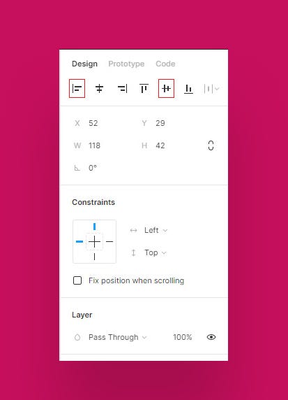
Logo Constraints :
- Select your logo, then go to the Constraints section in the proprieties panel in the sidebar.

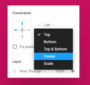
Vertical constraint :
- Click on the arrow next to top.
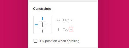
- In the drop-down menu Select center.
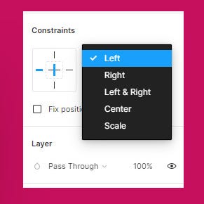
Horizontal constraint :
For the horizontal constraint, keep it on left (if it’s not already on the left position, set it to left).
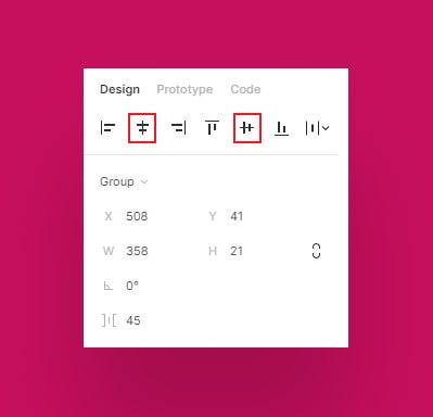
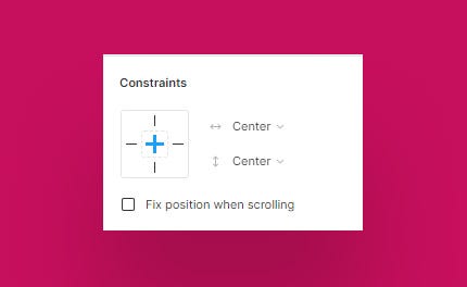
Menu Constraints :
- Select your menu and set its horizontal constraint to center and the vertical to center.
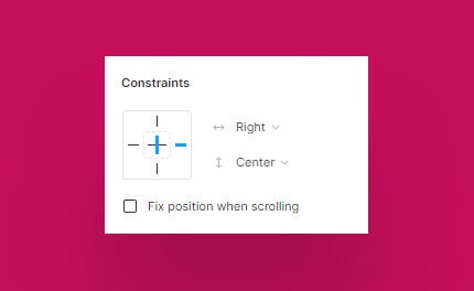
Button Constraints :
- For the Button, set its horizontal constraint to right and its vertical to center.
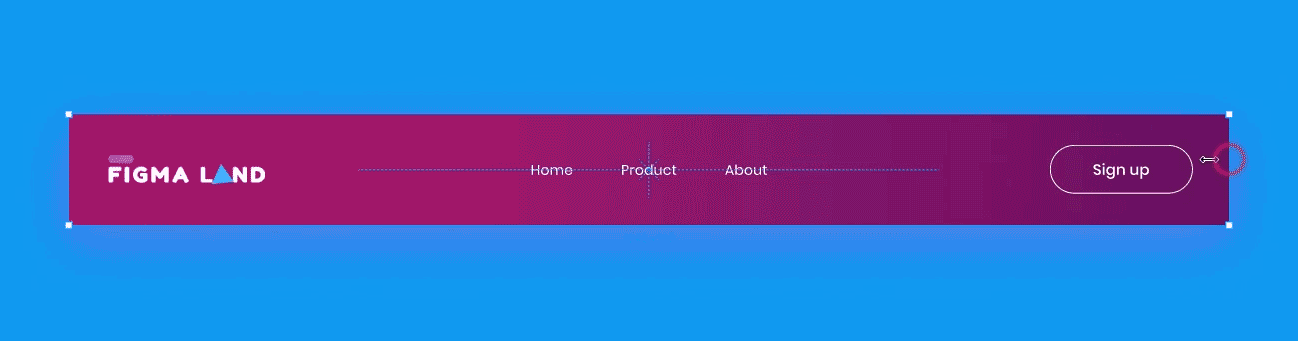
Now if we resize our frame, Both vertically and horizontally, we’ll see that our Navbar is fully Responsive.

For More Figma Tutorials, Free Templates, UI kits and Resources.
Before you go
Feel free to visit our website captain-design.com where we are sharing generously, ready for commercial use Figma and HTML templates.
You’ll find three things to help you kickstart your next project’s design :


